
Mastering Python Data Visualization using Matplotlib
In this comprehensive lesson provided by Edulane, you’ll gain a deep understanding of data visualization using Matplotlib, a powerful Python library. This session is designed to equip you with the skills to create a wide variety of plots and customize them to meet your analytical needs. You’ll learn how to:
- Create Basic Plots: Generate line plots, bar charts, and scatter plots to visualize data effectively.
- Customize Visualizations: Adjust colors, styles, and markers to enhance the readability and appeal of your plots.
- Utilize Subplots: Display multiple plots in a single figure for comparative analysis.
- Generate Histograms and Scatter Plots: Understand data distribution and relationships between variables.
- Follow Best Practices: Implement best practices for effective data visualization, including consistent styling, clear labeling, and layout adjustments.
- Work on Practical Exercises: Apply your knowledge with hands-on exercises to create various plots and analyze datasets.
The lesson is structured to provide both theoretical insights and practical examples, ensuring you can apply what you’ve learned to real-world data visualization challenges.
Table of Contents
- Data Visualization in Python
- Why Use Data Visualization?
- Best Practices for Data Visualization
- Key Libraries for Data Visualization in Python
- Comprehensive Practice Exercises
- Interview Questions and Answers
Data Visualization in Python
Data visualization in Python involves representing data in a graphical format, making it easier to identify patterns, trends, and outliers. Python offers several libraries for data visualization, with Matplotlib, Seaborn, and Plotly being some of the most popular. These libraries provide a wide range of plotting functions and customization options to create informative and aesthetically pleasing visual representations of data.
Why Use Data Visualization?
- Pattern Recognition: Helps identify patterns and trends in data that may not be apparent from raw numbers.
- Data Exploration: Facilitates the exploratory data analysis (EDA) process to uncover insights and inform further analysis.
- Communication: Effectively communicates findings and insights to stakeholders through clear and concise visuals.
- Decision Making: Supports data-driven decision-making by presenting data in an intuitive and understandable format.
Best Practices for Data Visualization
- Clarity: Ensure that the visualizations are clear and easy to understand.
- Accuracy: Represent the data accurately without distorting the information.
- Simplicity: Avoid unnecessary complexity; keep the design simple and focused.
- Consistency: Use consistent colors, scales, and labeling across different plots.Context: Provide context with appropriate titles, labels, legends, and annotations.
Data visualization is a crucial aspect of data analysis and communication, enabling data scientists and analysts to convey complex information effectively and support data-driven decisions. Read More

Key Libraries for Data Visualization in Python
Matplotlib
Matplotlib is a widely used Python library for creating static, animated, and interactive visualizations. It is highly versatile and allows users to generate a variety of plots and charts, including line plots, bar charts, histograms, scatter plots, and more. Here’s an overview:
Key Features:
- Versatility: Create a wide range of plots from simple line charts to complex multi-panel figures.
- Customizability: Extensive options for customizing the appearance of plots, including colors, markers, line styles, and labels.
- Integration: Works well with other libraries like NumPy and pandas, making it easy to visualize data from these sources.
- Interactivity: Supports interactive plotting features with tools like Matplotlib’s widgets and integration with Jupyter notebooks.
- Static, Animated, and Interactive Plots: Generate static images, animations, and interactive plots to enhance data analysis.
Example:
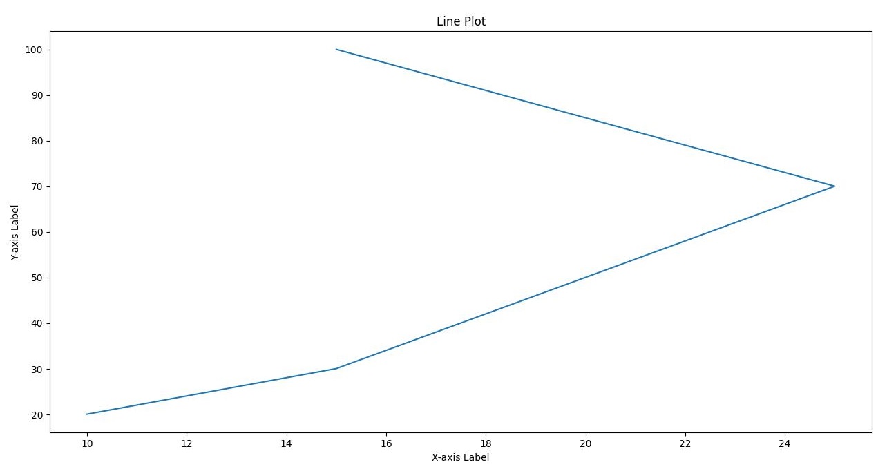
import matplotlib.pyplot as plt

# Data
x = [10, 15, 20, 25, 15]
y = [20, 30, 50, 70, 100]

# Create a line plot
plt.plot(x, y)

# Add labels and title
plt.xlabel('X-axis Label')
plt.ylabel('Y-axis Label')
plt.title('Line Plot')

# Display the plot
plt.show()
Output:
Common Plot Types:
- Line Plots: Ideal for showing trends over time.
- Bar Charts: Useful for comparing quantities across categories.
- Histograms: Show the distribution of data points.
- Scatter Plots: Reveal relationships between two variables.
- Matplotlib is a foundational tool in data science and analytics, widely used for its flexibility and comprehensive range of plotting capabilities.
- Matplotlib is a powerful library for creating static, animated, and interactive visualizations in Python. It is particularly useful for creating line plots, bar charts, histograms, and scatter plots. In this session, we will cover:
- Basic Plots
- Customization
- Subplots
- Histograms
- Scatter Plots
Basic Plots
Basic plots include line plots and bar charts, which are the simplest forms of data visualization.
Line Plot Example
import matplotlib.pyplot as plt

# Data
x = [1, 2, 3, 4, 5]
y = [2, 3, 5, 7, 11]

# Create a line plot
plt.plot(x, y)

# Add labels and title
plt.xlabel('X-axis Label')
plt.ylabel('Y-axis Label')
plt.title('Line Plot Example')

# Display the plot
plt.show()
Output:
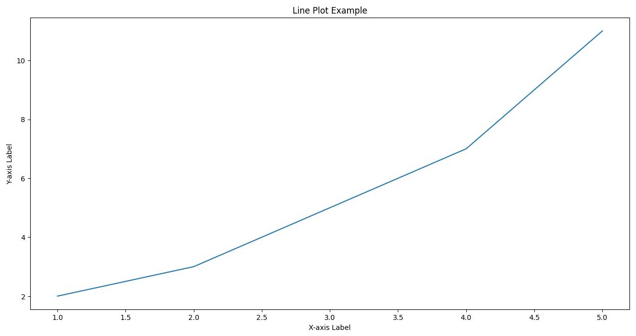
Explanation:
- Plot: Shows a simple line plot with points connected by a line.
- Labels and Title: The x-axis is labeled “X-axis Label”, the y-axis is labeled “Y-axis Label”, and the plot has a title “Line Plot Example”.
Customization
Customization allows you to modify the appearance of your plots, including colors, line styles, and markers.
Customization Example
import matplotlib.pyplot as plt

# Data
x = [1, 2, 3, 4, 5]
y = [2, 3, 5, 7, 11]

# Create a customized line plot
plt.plot(x, y, color='green', linestyle='--', marker='o')

# Add labels, title, and legend
plt.xlabel('X-axis Label')
plt.ylabel('Y-axis Label')
plt.title('Customized Line Plot')
plt.legend(['Data Line'])

# Display the plot
plt.show()
Output:
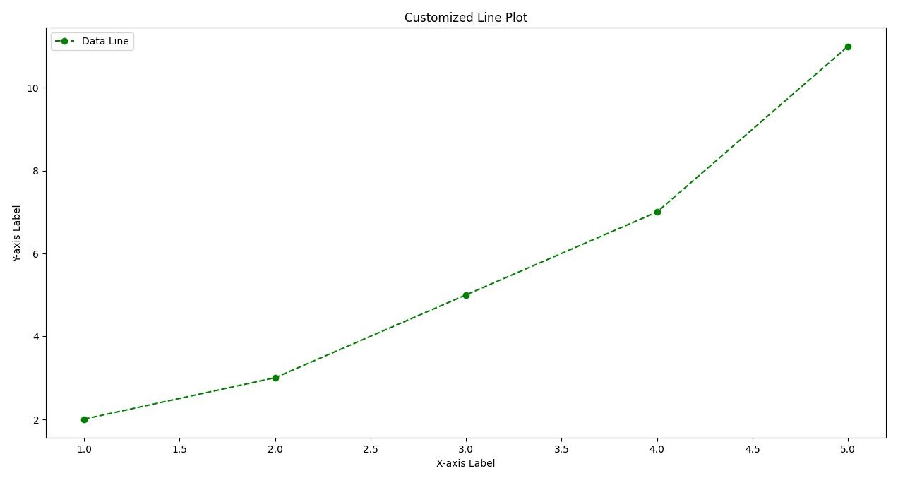
Explanation:
- Color: The line color is green.
- Line Style: The line is dashed.
- Marker: Data points are marked with circles.
- Legend: Adds a legend to describe the data line.
Subplots
Subplots allow you to create multiple plots in a single figure, useful for comparing different datasets or different views of the same dataset.
Subplots Example
import matplotlib.pyplot as plt

# Create a figure with 2x2 subplots
fig, axs = plt.subplots(2, 2)

# Data
x = [1, 2, 3, 4, 5]
y1 = [2, 3, 5, 7, 11]
y2 = [1, 4, 6, 8, 10]
y3 = [5, 6, 7, 8, 9]
y4 = [7, 8, 9, 10, 11]

# Plot in each subplot
axs[0, 0].plot(x, y1)
axs[0, 0].set_title('Plot 1')

axs[0, 1].plot(x, y2, 'tab:orange')
axs[0, 1].set_title('Plot 2')

axs[1, 0].plot(x, y3, 'tab:green')
axs[1, 0].set_title('Plot 3')

axs[1, 1].plot(x, y4, 'tab:red')
axs[1, 1].set_title('Plot 4')

# Set common labels
for ax in axs.flat:
    ax.set(xlabel='X-axis', ylabel='Y-axis')

# Adjust layout
plt.tight_layout()

# Display the plots
plt.show()
Output:
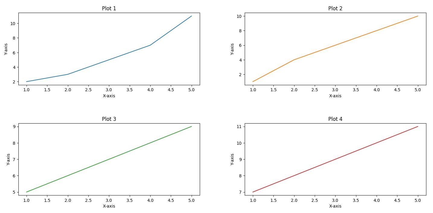
Explanation:
- Subplots: A 2×2 grid of subplots with different data plotted in each subplot.
- Titles and Labels: Each subplot has its own title and shared x and y-axis labels.
- Layout:
plt.tight_layout()adjusts the layout to prevent overlap.
Histograms
Histograms represent the distribution of a dataset by dividing the data into bins and counting the number of observations in each bin.
Histogram Example
import numpy as np
import matplotlib.pyplot as plt

# Generate random data
data = np.random.randn(1000)

# Create a histogram
plt.hist(data, bins=30, alpha=0.7, color='blue')

# Add labels and title
plt.xlabel('Value')
plt.ylabel('Frequency')
plt.title('Histogram Example')

# Display the histogram
plt.show()
Output:
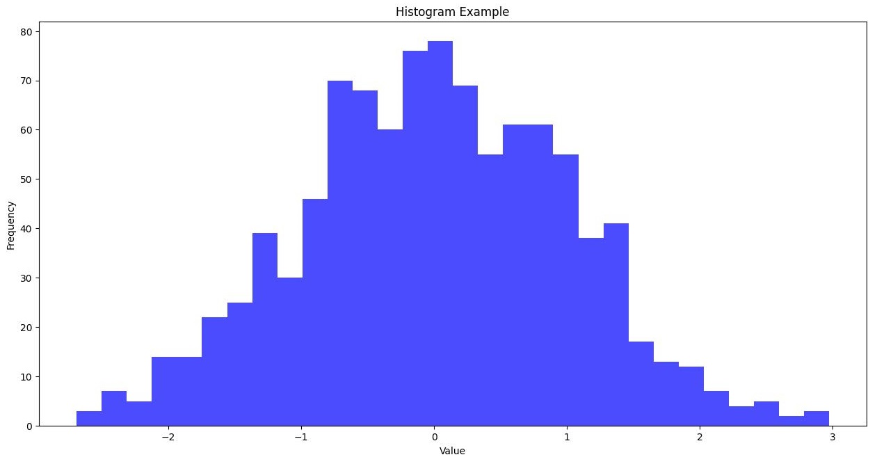
Explanation:
- Histogram: Shows the distribution of random data with 30 bins.
- Labels and Title: The x-axis is labeled “Value”, the y-axis is labeled “Frequency”, and the plot has a title “Histogram Example”.
Scatter Plots
Scatter plots display individual data points, useful for showing the relationship between two variables.
Scatter Plot Example
import matplotlib.pyplot as plt

# Data
x = [1, 2, 3, 4, 5]
y = [2, 3, 5, 7, 11]

# Create a scatter plot
plt.scatter(x, y, color='red')

# Add labels and title
plt.xlabel('X-axis Label')
plt.ylabel('Y-axis Label')
plt.title('Scatter Plot Example')

# Display the scatter plot
plt.show()
Output:
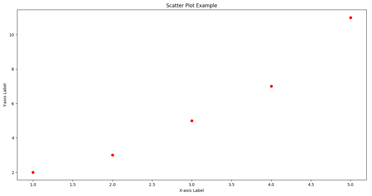
Explanation:
- Scatter Plot: Displays individual data points with red markers.
- Labels and Title: The x-axis is labeled “X-axis Label”, the y-axis is labeled “Y-axis Label”, and the plot has a title “Scatter Plot Example”.
Best Practices
- Consistent Style: Maintain a consistent style across all plots to improve readability.
- Example: Use a common color palette and line styles.
plt.style.use('seaborn-darkgrid')- Label Everything: Always label your axes and add a title to your plots.
- Example:
plt.xlabel('X-axis Label')
plt.ylabel('Y-axis Label')
plt.title('Plot Title')- Legends: Use legends to explain different data series in your plots.
- Example:
plt.legend(['Data Line'])- Save Plots: Save your plots for future reference or publication.
- Example:
plt.savefig('plot.png')- Subplots for Comparison: Use subplots to compare multiple datasets within a single figure.
- Example:
fig, axs = plt.subplots(2, 2)Matplotlib Cheat Sheet
# matplotlib_functions.py

import matplotlib.pyplot as plt
import numpy as np
import pandas as pd

# Generate sample data
x = np.linspace(0, 10, 100)
y = np.sin(x)
data = pd.DataFrame({'x': x, 'y': y})

# 1. Line Plot
# A basic plot that shows the relationship between two variables.
plt.figure()
plt.plot(x, y, label='sin(x)')
plt.title('Line Plot')
plt.xlabel('X-axis')
plt.ylabel('Y-axis')
plt.legend()
plt.show()

# 2. Scatter Plot
# Used to plot individual data points.
plt.figure()
plt.scatter(x, y, label='data points')
plt.title('Scatter Plot')
plt.xlabel('X-axis')
plt.ylabel('Y-axis')
plt.legend()
plt.show()

# 3. Bar Plot
# Used to plot categorical data.
categories = ['A', 'B', 'C']
values = [10, 24, 36]
plt.figure()
plt.bar(categories, values, color=['red', 'blue', 'green'])
plt.title('Bar Plot')
plt.xlabel('Categories')
plt.ylabel('Values')
plt.show()

# 4. Histogram
# Used to show the distribution of a numerical variable.
data = np.random.randn(1000)
plt.figure()
plt.hist(data, bins=30, edgecolor='black')
plt.title('Histogram')
plt.xlabel('Value')
plt.ylabel('Frequency')
plt.show()

# 5. Box Plot
# Used to show the distribution of a dataset based on a five-number summary.
data = [np.random.normal(0, std, 100) for std in range(1, 4)]
plt.figure()
plt.boxplot(data, vert=True, patch_artist=True)
plt.title('Box Plot')
plt.xlabel('Category')
plt.ylabel('Value')
plt.show()

# 6. Violin Plot
# Combines the benefits of box plots and KDE.
plt.figure()
plt.violinplot(data, showmeans=False, showmedians=True)
plt.title('Violin Plot')
plt.xlabel('Category')
plt.ylabel('Value')
plt.show()

# 7. Pie Chart
# Used to show the proportions of a whole.
sizes = [15, 30, 45, 10]
labels = ['A', 'B', 'C', 'D']
plt.figure()
plt.pie(sizes, labels=labels, autopct='%1.1f%%', startangle=140)
plt.title('Pie Chart')
plt.show()

# 8. Subplots
# Multiple plots in one figure.
fig, axs = plt.subplots(2, 2, figsize=(10, 10))

# Line plot
axs[0, 0].plot(x, y)
axs[0, 0].set_title('Line Plot')

# Scatter plot
axs[0, 1].scatter(x, y)
axs[0, 1].set_title('Scatter Plot')

# Bar plot
axs[1, 0].bar(categories, values, color=['red', 'blue', 'green'])
axs[1, 0].set_title('Bar Plot')

# Histogram
axs[1, 1].hist(data[0], bins=30, edgecolor='black')
axs[1, 1].set_title('Histogram')

plt.tight_layout()
plt.show()

# 9. Heatmap
# Used to show the magnitude of a phenomenon as color in two dimensions.
data = np.random.rand(10, 10)
plt.figure()
plt.imshow(data, cmap='hot', interpolation='nearest')
plt.title('Heatmap')
plt.colorbar()
plt.show()

# 10. 3D Plot
# Used to plot data in three dimensions.
from mpl_toolkits.mplot3d import Axes3D
fig = plt.figure()
ax = fig.add_subplot(111, projection='3d')
z = np.linspace(0, 10, 100)
x = np.sin(z)
y = np.cos(z)
ax.plot(x, y, z)
ax.set_title('3D Plot')
plt.show()

# 11. Error Bars
# Used to show the variability of data.
x = np.linspace(0, 10, 10)
dy = 0.2
y = np.sin(x) + dy * np.random.randn(10)
plt.figure()
plt.errorbar(x, y, yerr=dy, fmt='.k')
plt.title('Error Bars')
plt.xlabel('X-axis')
plt.ylabel('Y-axis')
plt.show()

# 12. Stem Plot
# Used to plot data points as stems.
plt.figure()
plt.stem(x, y, use_line_collection=True)
plt.title('Stem Plot')
plt.xlabel('X-axis')
plt.ylabel('Y-axis')
plt.show()

# 13. Step Plot
# Used to plot data as steps.
plt.figure()
plt.step(x, y, where='mid')
plt.title('Step Plot')
plt.xlabel('X-axis')
plt.ylabel('Y-axis')
plt.show()

# 14. Fill Between
# Used to fill the area between two curves.
y1 = np.sin(x)
y2 = np.sin(x) + 0.5
plt.figure()
plt.fill_between(x, y1, y2, color='lightblue')
plt.title('Fill Between')
plt.xlabel('X-axis')
plt.ylabel('Y-axis')
plt.show()

# 15. Polar Plot
# Used to plot data in polar coordinates.
theta = np.linspace(0, 2 * np.pi, 100)
r = np.abs(np.sin(theta))
plt.figure()
plt.polar(theta, r)
plt.title('Polar Plot')
plt.show()

# 16. Logarithmic Plot
# Used to plot data with logarithmic scaling.
x = np.logspace(0.1, 2, 100)
y = np.exp(x)
plt.figure()
plt.plot(x, y)
plt.xscale('log')
plt.yscale('log')
plt.title('Logarithmic Plot')
plt.xlabel('Log(X-axis)')
plt.ylabel('Log(Y-axis)')
plt.show()

# 17. Quiver Plot
# Used to plot vectors as arrows.
x, y = np.meshgrid(np.arange(-10, 10, 1), np.arange(-10, 10, 1))
u = -1 - x**2 + y
v = 1 + x - y**2
plt.figure()
plt.quiver(x, y, u, v)
plt.title('Quiver Plot')
plt.xlabel('X-axis')
plt.ylabel('Y-axis')
plt.show()

# 18. Stream Plot
# Used to plot vector fields.
plt.figure()
plt.streamplot(x, y, u, v)
plt.title('Stream Plot')
plt.xlabel('X-axis')
plt.ylabel('Y-axis')
plt.show()

# 19. Contour Plot
# Used to plot contours of a function.
X, Y = np.meshgrid(np.linspace(-3, 3, 100), np.linspace(-3, 3, 100))
Z = np.sin(np.sqrt(X**2 + Y**2))
plt.figure()
plt.contour(X, Y, Z)
plt.title('Contour Plot')
plt.xlabel('X-axis')
plt.ylabel('Y-axis')
plt.show()

# 20. Tri-Surface Plot
# Used to plot a triangulated surface.
from mpl_toolkits.mplot3d import Axes3D
fig = plt.figure()
ax = fig.add_subplot(111, projection='3d')
x = np.random.rand(100)
y = np.random.rand(100)
z = np.random.rand(100)
ax.plot_trisurf(x, y, z)
ax.set_title('Tri-Surface Plot')
plt.show()
Explanation of Functions
- Line Plot:
plt.plot()creates a simple line plot. - Scatter Plot:
plt.scatter()creates a scatter plot with individual data points. - Bar Plot:
plt.bar()creates a bar plot for categorical data. - Histogram:
plt.hist()shows the distribution of a dataset. - Box Plot:
plt.boxplot()displays the distribution based on a five-number summary. - Violin Plot:
plt.violinplot()combines box plot and KDE to show distributions. - Pie Chart:
plt.pie()shows proportions of a whole. - Subplots:
plt.subplots()creates multiple plots in one figure. - Heatmap:
plt.imshow()displays a matrix of data with color-coded values. - 3D Plot:
ax.plot()creates a 3D plot. - Error Bars:
plt.errorbar()shows variability of data. - Stem Plot:
plt.stem()plots data points as stems. - Step Plot:
plt.step()plots data as steps. - Fill Between:
plt.fill_between()fills the area between two curves. - Polar Plot:
plt.polar()creates a plot in polar coordinates. - Logarithmic Plot:
plt.plot()withset_xscale('log')andset_yscale('log')creates a logarithmic plot. - Quiver Plot:
plt.quiver()plots vectors as arrows. - Stream Plot:
plt.streamplot()plots vector fields. - Contour Plot:
plt.contour()plots contours of a function. - Tri-Surface Plot:
ax.plot_trisurf()creates a triangulated surface plot.
Seaborn
- Overview: Built on top of Matplotlib, Seaborn provides a high-level interface for drawing attractive statistical graphics. It simplifies the creation of complex visualizations.
- Use Cases: Heatmaps, time series, categorical plots, and distribution plots.
- Example:
import seaborn as sns
import matplotlib.pyplot as plt

# Load dataset
tips = sns.load_dataset('tips')

# Create a box plot
sns.boxplot(x='day', y='total_bill', data=tips)

# Display the plot
plt.show()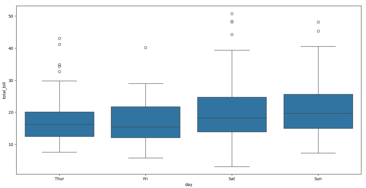
Exercises
Exercise: Create Various Plots to Visualize a Dataset
- Dataset: Use any dataset you prefer, such as one from the Seaborn library or generated using NumPy.
import seaborn as sns
data = sns.load_dataset('iris')Tasks–
- Line Plot: Create a line plot of the sepal length vs. sepal width.
- Customization: Customize the line plot with different colors, line styles, and markers.
- Subplot: Create a subplot with sepal length vs. sepal width and petal length vs. petal width.
- Histogram: Generate a histogram to show the distribution of sepal length.
- Scatter Plot: Create a scatter plot to show the relationship between sepal length and petal length.
Plotly
- Overview: A graphing library that makes interactive, publication-quality graphs online. Plotly can create interactive plots that can be embedded in web applications.
- Use Cases: Interactive line plots, bar charts, scatter plots, 3D plots, and dashboards.
- Example:
import plotly.express as px

# Data
df = px.data.iris()

# Create a scatter plot
fig = px.scatter(df, x='sepal_width', y='sepal_length', color='species')

# Display the plot
fig.show()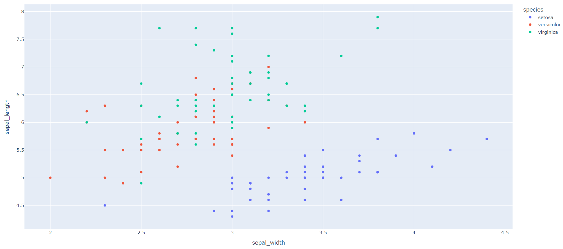
Comprehensive Practice Exercises
Exercise 1: Basic Line Plot
Question: Create a simple line plot showing the relationship between two sets of data points: x = [0, 1, 2, 3, 4] and y = [0, 2, 4, 6, 8]. Add appropriate labels for the x-axis and y-axis and a title for the plot.
Hint: Use the plt.plot() function to create the line plot, and plt.xlabel(), plt.ylabel(), and plt.title() to add labels and a title.
Expectation: You should see a straight line with labels on both axes and a title at the top.
Exercise 2: Bar Chart
Question: Create a bar chart representing the number of students in different classes. Use the classes [‘Class A’, ‘Class B’, ‘Class C’] and the corresponding number of students [30, 25, 40]. Customize the colors and add grid lines.
Hint: Use the plt.bar() function to create the bar chart. Customize colors using the color parameter and add grid lines using plt.grid(True).
Expectation: A bar chart with three bars in different colors, with grid lines for better readability.
Exercise 3: Histogram
Question: Generate random data following a normal distribution and create a histogram to visualize the distribution. Use 1000 data points and 30 bins. Add a density plot overlay to show the data’s distribution curve.
Hint: Use np.random.randn() to generate the data and plt.hist() to create the histogram. Overlay the density plot using sns.kdeplot() from the Seaborn library.
Expectation: A histogram with bars showing the frequency distribution and a smooth density curve overlay.
Exercise 4: Subplots
Question: Create a figure with four subplots (2×2 grid) showing different types of plots: line plot, scatter plot, histogram, and bar chart. Use random data for the plots.
Hint: Use plt.subplots() to create the grid of subplots and axs[row, col] to access each subplot. Use different plotting functions (plt.plot(), plt.scatter(), plt.hist(), plt.bar()) for each subplot.
Expectation: A figure with four distinct subplots, each demonstrating a different type of plot.
Exercise 5: Scatter Plot with Regression Line
Question: Create a scatter plot showing the relationship between two variables. Generate 50 random data points for x and y, and add a regression line to indicate the trend.
Hint: Use np.random.rand() to generate random data and sns.regplot() to create the scatter plot with a regression line.
Expectation: A scatter plot with individual data points and a fitted regression line showing the overall trend.
Exercise 6: Pie Chart with Percentages
Question: Create a pie chart showing the market share of different companies. Use the companies [‘Company A’, ‘Company B’, ‘Company C’, ‘Company D’] and their respective market shares [35, 25, 25, 15]. Display the percentage for each segment.
Hint: Use plt.pie() to create the pie chart and autopct='%1.1f%%' to display percentages.
Expectation: A pie chart with four segments, each labeled with the corresponding company and its market share percentage.
Exercise 7: Box Plot for Data Distribution
Question: Generate random data for four different groups and create a box plot to visualize the data distribution. Use 100 data points for each group and ensure the plot includes quartiles and potential outliers.
Hint: Use np.random.normal() to generate the data and plt.boxplot() to create the box plot.
Expectation: A box plot with four boxes, each representing a different group’s data distribution, showing the median, quartiles, and any outliers.
Exercise 8: Customizing Plot Appearance
Question: Create a line plot with multiple lines to compare different datasets. Use the data: x = [1, 2, 3, 4, 5], y1 = [1, 4, 9, 16, 25], y2 = [1, 2, 3, 4, 5]. Customize the line styles, colors, and markers. Add a legend to distinguish between the datasets.
Hint: Use plt.plot() with different line styles, colors, and markers (e.g., linestyle='--', color='red', marker='o'). Add a legend using plt.legend().
Expectation: A line plot with two lines, each with distinct styles and markers, and a legend indicating which line corresponds to which dataset.
Exercise 9: Annotating Plots
Question: Create a scatter plot and annotate specific points of interest. Use the data: x = [1, 2, 3, 4, 5], y = [2, 3, 5, 7, 11]. Annotate the point (3, 5) with the label ‘Important Point’.
Hint: Use plt.scatter() to create the scatter plot and plt.annotate() to add the annotation.
Expectation: A scatter plot with an annotation pointing to the specified data point, clearly labeled as ‘Important Point’.
Exercise 10: Combining Multiple Plots
Question: Combine a line plot and a bar chart in a single figure to compare monthly sales data. Use the data: months = [‘Jan’, ‘Feb’, ‘Mar’, ‘Apr’, ‘May’], sales = [100, 150, 200, 250, 300], costs = [80, 130, 180, 230, 280]. Plot the sales as a line plot and the costs as a bar chart.
Hint: Use plt.plot() for the line plot and plt.bar() for the bar chart. Overlay them in a single figure by calling the plot functions sequentially.
Expectation: A combined figure with both a line plot and a bar chart, effectively showing the comparison between sales and costs for each month.
Challenging Tasks for Real-Time Projects Data Visualization with Matplotlib
Task 1: Stock Price Analysis
Question: Using historical stock price data for multiple companies, create an interactive plot to analyze trends and patterns over time. Include the following features:
- Line plots for stock prices of three different companies over a year.
- Highlight significant events or anomalies with annotations.
- Add a moving average line to smooth out short-term fluctuations and highlight longer-term trends.
Hint: Use pd.read_csv() to load the data, plt.plot() for line plots, and plt.annotate() for annotations. Use rolling means from pandas for moving averages.
Expectation: An interactive plot showing stock price trends with annotations for significant events and a moving average line for trend analysis.
Task 2: Customer Segmentation Analysis
Question: Visualize the results of a customer segmentation analysis using K-Means clustering. Use a dataset of customer purchase behavior, and create scatter plots to display clusters. Include:
- Scatter plots of customers segmented into different clusters based on purchase frequency and amount.
- Distinguish clusters with different colors and markers.
- Annotate centroids of each cluster.
Hint: Use KMeans from scikit-learn for clustering, plt.scatter() for scatter plots, and plt.annotate() for centroids.
Expectation: A scatter plot showing distinct customer segments, each with unique colors and markers, and annotated centroids.
Task 3: Sales Performance Dashboard
Question: Create a dashboard to visualize sales performance across different regions and product categories. Include:
- Bar charts showing total sales per region.
- Stacked bar charts to break down sales by product categories.
- A line plot for monthly sales trends over the past year.
Hint: Use plt.bar() for bar charts, plt.barh() for horizontal bar charts, and plt.plot() for line plots. Utilize subplots for the dashboard layout.
Expectation: A comprehensive dashboard with multiple plots showing regional sales, category breakdowns, and monthly trends.
Task 4: Real Estate Price Distribution
Question: Analyze and visualize the distribution of real estate prices in different neighborhoods of a city. Use a dataset of real estate listings and create:
- A histogram to show the price distribution.
- A box plot to compare price distributions across different neighborhoods.
- Scatter plots to show the relationship between property size and price.
Hint: Use plt.hist() for histograms, plt.boxplot() for box plots, and plt.scatter() for scatter plots.
Expectation: Visualizations showing the distribution of real estate prices, comparisons across neighborhoods, and the relationship between property size and price.
Task 5: Environmental Data Analysis
Question: Visualize environmental data to analyze trends in air quality over time. Use a dataset of air quality measurements (e.g., PM2.5 levels) from different locations and include:
- Line plots to show daily average PM2.5 levels over a year.
- Heatmaps to visualize PM2.5 levels across different locations and months.
- Scatter plots to show the correlation between PM2.5 levels and weather conditions (e.g., temperature, humidity).
Hint: Use plt.plot() for line plots, sns.heatmap() from Seaborn for heatmaps, and plt.scatter() for scatter plots.
Expectation: Visualizations depicting trends in air quality, spatial and temporal variations, and correlations with weather conditions.
Challenging Data Visualization Tasks with Real-Time Project Data
Task 1: Analyzing Stock Market Data
Objective: Create a multi-line plot to analyze the stock prices of multiple companies over time. Use data from a CSV file containing daily stock prices for three companies over the past year.
Data: You can use the Yahoo Finance Stock Data to download historical stock prices for companies like Apple (AAPL), Google (GOOGL), and Microsoft (MSFT).
Expectations:
- Plot the closing prices for each company on the same graph.
- Add appropriate labels, a legend, and a title.
- Highlight significant dates with annotations.
Hint: Use plt.plot() for each company’s data and plt.annotate() for highlighting significant dates.(You can also use this for getting data – https://pypi.org/project/yfinance/ OR https://www.kaggle.com/datasets/yasserhessein/yahoo-finance-dataset)
Task 2: Visualizing Global Temperature Changes
Objective: Create a heatmap to visualize global temperature changes over the past century. Use a dataset containing average annual temperatures for different regions of the world.
Data: You can use the Global Temperature Data for this task.
Expectations:
- Use a heatmap to show temperature changes over time.
- Add a color bar to indicate temperature ranges.
- Include a title and labels for axes.
Hint: Use sns.heatmap() from the Seaborn library for creating the heatmap.
Task 3: Sales Analysis Dashboard
Objective: Create a dashboard with multiple subplots to analyze sales data for an online retail company. The data includes monthly sales, customer demographics, and product categories.
Data: You can use the Online Retail Dataset from the UCI Machine Learning Repository.
Expectations:
- Include subplots for monthly sales trends, sales by product category, and customer demographics.
- Use different types of plots (line plots, bar charts, pie charts) for each analysis.
- Ensure the dashboard is well-organized with titles and legends for each subplot.
Hint: Use plt.subplots() to create a grid layout for the dashboard and different plotting functions for each subplot.
Task 4: COVID-19 Data Visualization
Objective: Create an interactive dashboard to visualize the spread of COVID-19 across different countries. The data should include daily confirmed cases, recoveries, and deaths.
Data: You can use the COVID-19 Data Repository by the Center for Systems Science and Engineering (CSSE) at Johns Hopkins University.
Expectations:
- Use interactive plots to allow users to select and compare different countries.
- Display trends for confirmed cases, recoveries, and deaths over time.
- Include tools for zooming and panning.
Hint: Use Plotly for creating interactive plots and Dash for building the interactive dashboard.
Task 5: Traffic Accident Analysis
Objective: Create a geographical plot to analyze traffic accidents in a city. Use data containing the location, time, and severity of accidents over the past year.
Data: You can use the Traffic Accidents Dataset from New York City Open Data.
Expectations:
- Use a scatter plot on a map to show the location of accidents.
- Color-code the points based on the severity of accidents.
- Add hover functionality to display details about each accident.
Hint: Use plotly.express.scatter_mapbox() for creating the geographical plot with interactive features.
These tasks challenge you to apply data visualization techniques to real-world datasets, requiring the use of various plotting functions, customization options, and interactive elements.
Interview Questions and Answers
- Q: What is Matplotlib?
- A: Matplotlib is a plotting library for the Python programming language and its numerical mathematics extension NumPy. It provides an object-oriented API for embedding plots into applications and offers a variety of plot types and customization options.
- Q: How do you create a basic line plot in Matplotlib?
- A: To create a basic line plot, use
plt.plot(x, y)wherexandyare lists or arrays of data points. Add labels and a title usingplt.xlabel(),plt.ylabel(), andplt.title(), and then callplt.show()to display the plot.
- A: To create a basic line plot, use
- Q: What are some common customization options in Matplotlib?
- A: Common customization options include changing line colors (
color), line styles (linestyle), markers (marker), and adding gridlines (plt.grid()). You can also adjust axis limits (plt.xlim(),plt.ylim()) and labels.
- A: Common customization options include changing line colors (
- Q: How do you add a legend to a plot?
- A: Add a legend using
plt.legend(). Specify the labels for each line or data series using thelabelparameter in theplotfunction. The legend will automatically use these labels.
- A: Add a legend using
- Q: What is a subplot in Matplotlib?
- A: A subplot is a way to display multiple plots in a single figure. You can create subplots using
plt.subplots(nrows, ncols)wherenrowsandncolsspecify the number of rows and columns of subplots.
- A: A subplot is a way to display multiple plots in a single figure. You can create subplots using
- Q: How do you create a histogram in Matplotlib?
- A: Use
plt.hist(data, bins)wheredatais a list or array of values andbinsis the number of bins you want to use. Customize the histogram withalphafor transparency andcolorfor the color of the bars.
- A: Use
- Q: What is the purpose of
plt.tight_layout()?- A:
plt.tight_layout()adjusts the spacing between subplots to prevent overlap and ensure that labels and titles are visible and not cut off.
- A:
- Q: How can you save a plot to a file in Matplotlib?
- A: Save a plot using
plt.savefig('filename.png'), specifying the file name and format (e.g., PNG, PDF). This method saves the current figure to a file.
- A: Save a plot using
- Q: How do you create a scatter plot?
- A: Use
plt.scatter(x, y)wherexandyare lists or arrays of data points. Customize the scatter plot with options likecolor,s(size of markers), andc(color map).
- A: Use
- Q: What is the difference between
plt.plot()andplt.scatter()?- A:
plt.plot()creates line plots connecting data points, whileplt.scatter()creates scatter plots displaying individual data points without connecting lines.
- A:
- Q: How do you add annotations to a plot?
- A: Use
plt.annotate('text', xy=(x, y))where'text'is the annotation text, andxyspecifies the point to annotate. Customize the appearance with additional parameters.
- A: Use
- Q: What is a box plot and when would you use it?
- A: A box plot displays the distribution of data based on quartiles and highlights outliers. It is useful for visualizing data spread and comparing distributions across multiple groups.
- Q: How can you modify the size of a plot?
- A: Modify the size of a plot by specifying the
figsizeparameter inplt.subplots(figsize=(width, height))wherewidthandheightare in inches.
- A: Modify the size of a plot by specifying the
- Q: How do you plot multiple datasets on the same plot?
- A: Plot multiple datasets by calling
plt.plot()orplt.scatter()multiple times before callingplt.show(). Use different colors or markers to distinguish between datasets.
- A: Plot multiple datasets by calling
- Q: What is the purpose of the
alphaparameter in Matplotlib?- A: The
alphaparameter controls the transparency of the plot elements. Values range from 0 (completely transparent) to 1 (completely opaque).
- A: The
- Q: How do you create a pie chart in Matplotlib?
- A: Use
plt.pie(sizes, labels=labels, autopct='%1.1f%%')wheresizesis a list of proportions,labelsare the categories, andautopctdisplays percentage labels.
- A: Use
- Q: What does
plt.grid(True)do?- A:
plt.grid(True)enables grid lines on the plot. Grid lines help to visualize the data points and make the plot easier to read.
- A:
- Q: How can you adjust the limits of the x and y axes?
- A: Adjust axis limits with
plt.xlim(lower, upper)andplt.ylim(lower, upper), wherelowerandupperare the limits for the respective axis.
- A: Adjust axis limits with
- Q: How do you change the font size of plot labels and titles?
- A: Change the font size using the
fontsizeparameter inplt.xlabel(),plt.ylabel(), andplt.title(). For example:plt.xlabel('X-axis', fontsize=14).
- A: Change the font size using the
- Q: How can you display the plot without using
plt.show()?- A: Display the plot inline in Jupyter notebooks by using
%matplotlib inlinemagic command at the beginning of the notebook. This renders plots automatically without needingplt.show().
- A: Display the plot inline in Jupyter notebooks by using
These questions cover fundamental concepts, common use cases, and advanced customization techniques in Matplotlib, providing a comprehensive overview for interview preparation.