
Mastering Advanced Data Visualization with Seaborn: Real-World Projects and Best Practices
Unlock the full potential of your data with advanced data visualization techniques using Seaborn. This comprehensive guide covers everything from the basics to advanced plotting, providing detailed explanations, best practices, and hands-on examples with real-world datasets. Whether you’re visualizing health metrics, analyzing technology usage trends, or tracking data science job salaries, this guide will equip you with the skills to create insightful and visually appealing charts. Learn how to use Seaborn’s powerful tools to enhance your data storytelling, customize plots for clarity, and leverage Kaggle for data exploration and sharing. Perfect for data enthusiasts looking to elevate their data visualization expertise to the next level.
Table of Contents
- Introduction to Seaborn
- Advanced Plotting Techniques
- Customizing Plots
- Real-Life Unique Projects
- Seaborn Cheat Sheet
- Using Kaggle
- Best Practices
- Conclusion
1. Introduction to Seaborn
Overview
Seaborn is a powerful Python library built on top of Matplotlib that provides a high-level interface for drawing attractive and informative statistical graphics. It is particularly useful for creating complex visualizations with minimal code and is well-suited for exploratory data analysis.
Seaborn Basics
Before diving into advanced topics, it’s essential to have a basic understanding of Seaborn. Here are some fundamental concepts:
- Importing Seaborn
- Loading datasets
- Basic plots
Working with DataFrames
Seaborn works well with Pandas DataFrames, which makes it easy to visualize data directly from DataFrames.
Basic Plotting Functions
Seaborn provides various basic plotting functions such as sns.scatterplot, sns.lineplot, sns.histplot, etc.
2. Advanced Plotting Techniques
Pair Plot
A pair plot allows you to visualize relationships between multiple pairs of variables. It is useful for exploring multidimensional data.
Example Code
# Import seaborn
import seaborn as sns

# Apply the default theme
sns.set_theme()

# Load an example dataset
tips = sns.load_dataset("tips")

# Create a visualization
sns.relplot(
    data=tips,
    x="total_bill", y="tip", col="time",
    hue="smoker", style="smoker", size="size",
)
Best Practices
- Hue: Use the
hueparameter to distinguish between different categories. - Palette: Choose a color palette that is easy to distinguish.
FacetGrid
FacetGrid is used to plot multiple charts based on the conditions of different categories in the dataset.
Example Code
# Load the tips dataset
tips = sns.load_dataset('tips')

# Create a FacetGrid
g = sns.FacetGrid(tips, col="time", row="smoker")
g.map(sns.histplot, "total_bill")
plt.show()
Best Practices
- Column and Row: Use meaningful variables for
colandrowto compare different subsets. - Mapping: Ensure the mapped function is appropriate for the data distribution.
Heatmap
Heatmaps are great for visualizing matrix-like data, such as correlation matrices.
Example Code
import seaborn as sns
import matplotlib.pyplot as plt
import pandas as pd
import numpy as np

# Generate example data
np.random.seed(0)
data = np.random.rand(10, 12)
data_frame = pd.DataFrame(data, columns=[f'Col{i}' for i in range(1, 13)],
                          index=[f'Row{i}' for i in range(1, 11)])

# Create a heatmap
plt.figure(figsize=(10, 8))
sns.heatmap(data_frame, annot=True, fmt=".2f", cmap='viridis', linewidths=.5)
plt.title('Seaborn Heatmap Example')
plt.xlabel('Columns')
plt.ylabel('Rows')
plt.show()
import seaborn as sns
import matplotlib.pyplot as plt
import pandas as pd
import requests
# Fetch real-time data from the disease.sh COVID-19 API
url = "https://disease.sh/v3/covid-19/countries"
response = requests.get(url)
data = response.json()
# Process the data to create a DataFrame
df = pd.DataFrame(data)
# Select relevant columns
df = df[['country', 'cases', 'deaths', 'recovered']]
# Filter for countries with significant case numbers
df = df[df['cases'] > 100000]
# Set the country as the index
df.set_index('country', inplace=True)
# Normalize the data for better heatmap visualization
df_normalized = df.div(df.max(axis=1), axis=0)
# Create a heatmap
plt.figure(figsize=(15, 10))
sns.heatmap(df_normalized, annot=True, fmt=".2f", cmap='coolwarm', linewidths=.5)
plt.title('COVID-19 Statistics Heatmap by Country')
plt.xlabel('Metrics')
plt.ylabel('Country')
plt.show()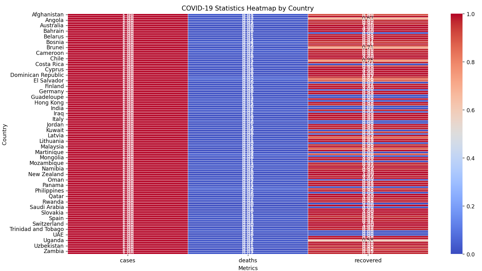
Best Practices
- Annotations: Use
annot=Trueto display the correlation values. - Color Map: Choose a color map that enhances the readability of the data.
3. Customizing Plots
Adding Titles and Labels
Adding titles and labels to your plots makes them more informative.
# Scatter plot with customization
sns.scatterplot(data=iris, x='sepal_length', y='sepal_width', hue='species')
plt.title('Sepal Length vs Sepal Width')
plt.xlabel('Sepal Length (cm)')
plt.ylabel('Sepal Width (cm)')
plt.legend(title='Species')
plt.show()
Styling
Seaborn offers various themes and styles to improve the aesthetics of your plots.
# Set the style
sns.set_style("whitegrid")

# Plot with the new style
sns.boxplot(data=tips, x='day', y='total_bill', palette='Set2')
plt.show()
4. Real-Life Unique Projects
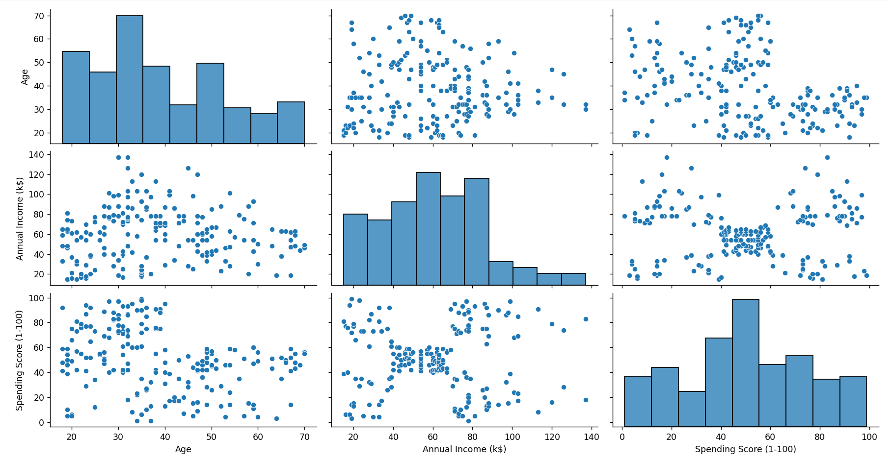
Project 1: Customer Segmentation Analysis
Dataset
Customer data including purchase history, demographics, and behavior metrics. Download a suitable dataset from Kaggle, such as the Mall Customer Segmentation Data.
Visualization Goals
- Identify distinct customer segments.
- Visualize purchasing patterns across segments.
Example
import pandas as pd
import seaborn as sns
import matplotlib.pyplot as plt

# Load the customer dataset
df_customers = pd.read_csv('Mall_Customers.csv')

# Plotting pair plot
sns.pairplot(df_customers[['Age', 'Annual Income (k$)', 'Spending Score (1-100)']])
plt.show()
Output:
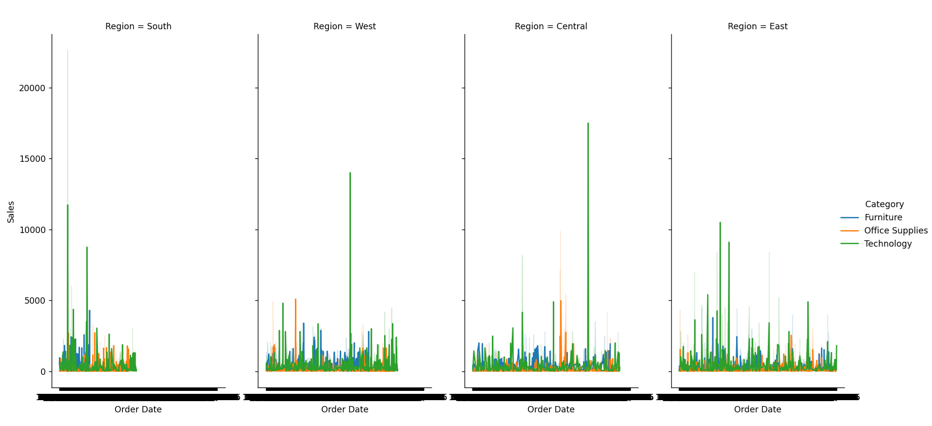
Project 2: Sales Performance Dashboard
Dataset
Sales data including regions, sales reps, products, and monthly sales figures. Download a suitable dataset from Kaggle, such as the Superstore Dataset.
Visualization Goals
- Compare sales performance across regions.
- Track sales trends over time.
Example
import pandas as pd
import seaborn as sns
import matplotlib.pyplot as plt
# Load sales dataset
sales_data = pd.read_csv('Superstore.csv')

# Create a FacetGrid for sales performance by region
g = sns.FacetGrid(sales_data, col="Region", hue="Category", height=4, aspect=1)
g.map(sns.lineplot, "Order Date", "Sales")
g.add_legend()
plt.show()
Output:
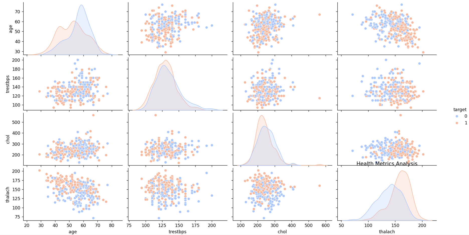
Project 3: Health Metrics Analysis
Dataset
Health metrics data including patient records, treatments, outcomes, and demographics. Download a suitable dataset from Kaggle, such as the Heart Disease Dataset.
Visualization Goals
- Analyze the distribution of various health metrics.
- Identify correlations between different health parameters.
- Visualize patient outcomes across different demographic groups.
Example
import pandas as pd
import seaborn as sns
import matplotlib.pyplot as plt
# Load the health metrics dataset
health_data = pd.read_csv('heart.csv')
# Pair plot for health metrics
sns.pairplot(health_data[['age', 'trestbps', 'chol', 'thalach', 'target']], hue='target', palette='coolwarm')
plt.title('Health Metrics Analysis')
plt.show()
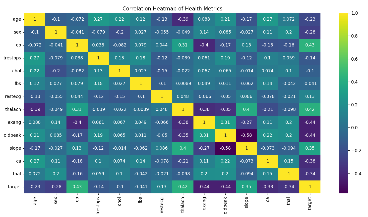
# Heatmap for correlation between health metrics
corr = health_data.corr()
sns.heatmap(corr, annot=True, cmap='viridis')
plt.title('Correlation Heatmap of Health Metrics')
plt.show()
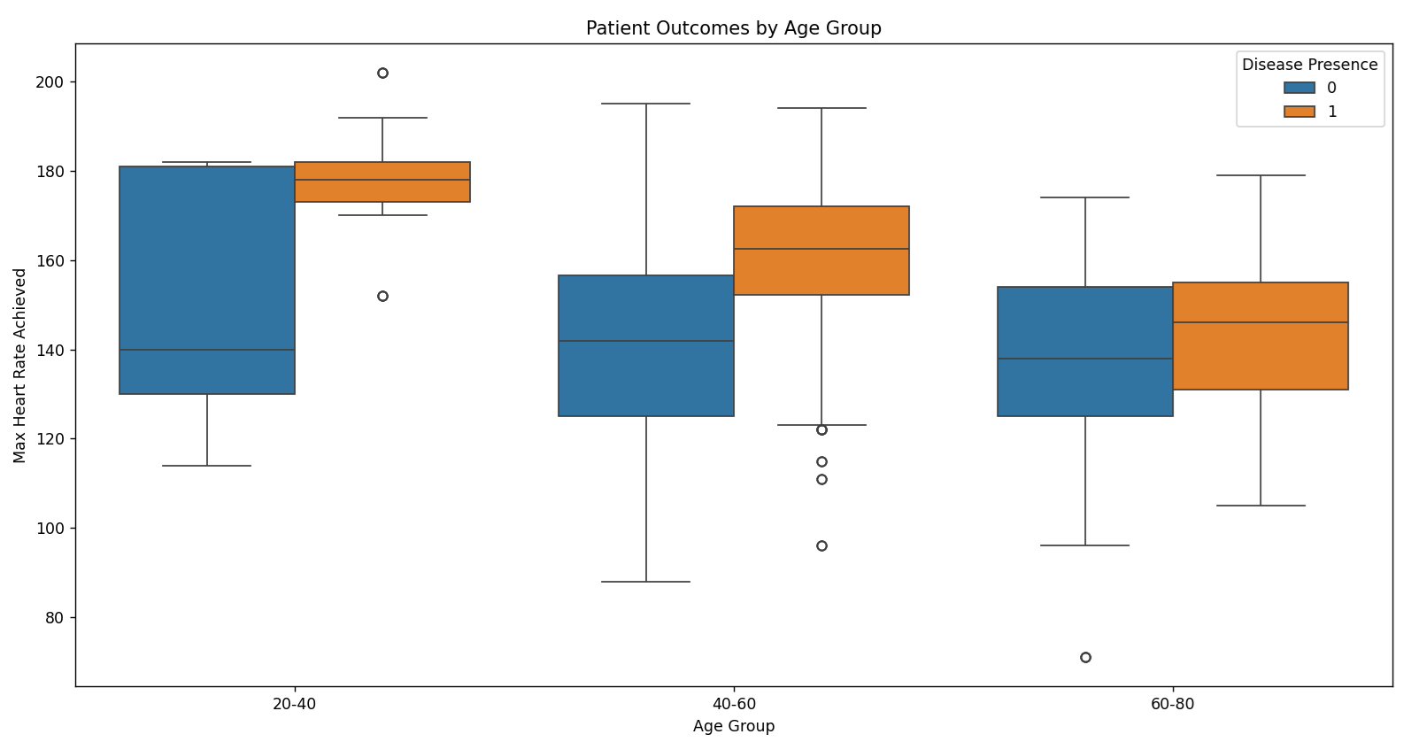
# Box plot for patient outcomes by age group
health_data['age_group'] = pd.cut(health_data['age'], bins=[20, 40, 60, 80], labels=['20-40', '40-60', '60-80'])
sns.boxplot(data=health_data, x='age_group', y='thalach', hue='target')
plt.title('Patient Outcomes by Age Group')
plt.xlabel('Age Group')
plt.ylabel('Max Heart Rate Achieved')
plt.legend(title='Disease Presence')
plt.show()
Output:
Project 4: Technology Usage Trends
Dataset
Technology usage data including app usage, screen time, and demographic information. Download a suitable dataset from Kaggle, such as the Technology Adoption Dataset. OR use this data
Visualization Goals
- Analyze trends in technology usage over time.
- Compare usage patterns across different demographics.
- Visualize the impact of technology on productivity.
Example
Project 5: Data Science Job Salaries Analysis
Dataset
Data on job salaries for data science positions across different years. A suitable dataset is the Data Science Job Salaries Dataset from Kaggle.
Visualization Goals
- Analyze trends in data science salaries over different years.
- Compare salary distributions across various job titles.
- Visualize the impact of experience and location on salaries.
Example
import pandas as pd
import seaborn as sns
import matplotlib.pyplot as plt

# Load the Data Science job salaries dataset
salary_data = pd.read_csv('data_science_salaries.csv')

# Convert the 'year' column to datetime for better handling
salary_data['year'] = pd.to_datetime(salary_data['year'], format='%Y')

# Line plot for salaries over the years
plt.figure(figsize=(12, 6))
sns.lineplot(data=salary_data, x='year', y='salary', hue='job_title', palette='Set1')
plt.title('Data Science Job Salaries Over the Years')
plt.xlabel('Year')
plt.ylabel('Average Salary (USD)')
plt.legend(title='Job Title')
plt.grid(True)
plt.show()

# Box plot for salary distribution by job title
plt.figure(figsize=(12, 6))
sns.boxplot(data=salary_data, x='job_title', y='salary', palette='Set2')
plt.title('Salary Distribution by Job Title')
plt.xlabel('Job Title')
plt.ylabel('Salary (USD)')
plt.xticks(rotation=45)
plt.show()

# FacetGrid for salary trends by experience level
salary_data['experience_level'] = pd.Categorical(salary_data['experience_level'],
                                                  categories=['Junior', 'Mid-level', 'Senior', 'Lead'],
                                                  ordered=True)
g = sns.FacetGrid(salary_data, col="experience_level", hue="job_title", height=4, aspect=1)
g.map(sns.lineplot, "year", "salary")
g.add_legend()
plt.title('Salary Trends by Experience Level')
plt.xlabel('Year')
plt.ylabel('Salary (USD)')
plt.show()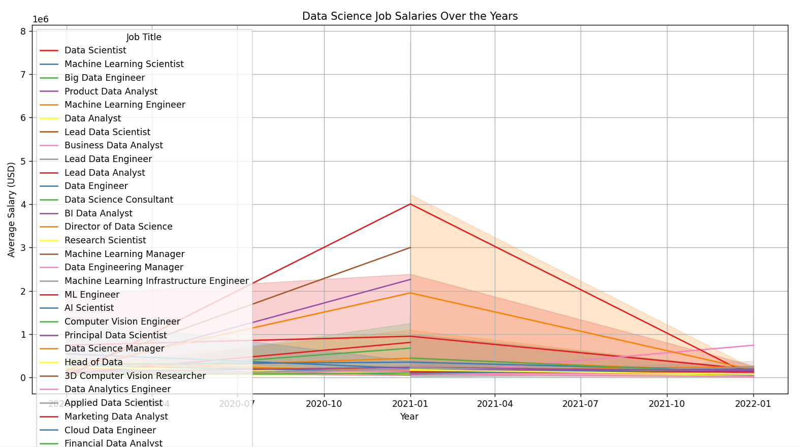
Seaborn Cheat Sheet
# seaborn_functions

import seaborn as sns
import matplotlib.pyplot as plt
import numpy as np
import pandas as pd

# Load example datasets
tips = sns.load_dataset('tips')
iris = sns.load_dataset('iris')
flights = sns.load_dataset('flights')
diamonds = sns.load_dataset('diamonds')

# Set the aesthetic style of the plots
sns.set(style="whitegrid")

# 1. Scatter Plot
# Used to plot the relationship between two variables with a dot for each data point.
sns.scatterplot(data=iris, x='sepal_length', y='sepal_width', hue='species')
plt.title('Scatter Plot of Sepal Length vs Sepal Width')
plt.show()

# 2. Line Plot
# Used to plot continuous data points as a line.
sns.lineplot(data=flights, x='year', y='passengers')
plt.title('Line Plot of Passengers Over Years')
plt.show()

# 3. Histogram
# Used to plot the distribution of a single variable.
sns.histplot(data=tips, x='total_bill', bins=30, kde=True)
plt.title('Histogram of Total Bill')
plt.show()

# 4. Box Plot
# Used to show the distribution of a quantitative variable and to compare between levels of a categorical variable.
sns.boxplot(data=tips, x='day', y='total_bill')
plt.title('Box Plot of Total Bill by Day')
plt.show()

# 5. Violin Plot
# Used to show the distribution of the data across different categories. It combines aspects of a box plot and a kernel density plot.
sns.violinplot(data=tips, x='day', y='total_bill', hue='sex', split=True)
plt.title('Violin Plot of Total Bill by Day and Sex')
plt.show()

# 6. Bar Plot
# Used to plot the mean value of a numeric variable for each category.
sns.barplot(data=tips, x='day', y='total_bill', ci=None)
plt.title('Bar Plot of Average Total Bill by Day')
plt.show()

# 7. Count Plot
# Used to show the counts of observations in each categorical bin using bars.
sns.countplot(data=tips, x='day')
plt.title('Count Plot of Days')
plt.show()

# 8. Heatmap
# Used to display data in a matrix form where values are represented with color intensity.
pivot_table = flights.pivot('month', 'year', 'passengers')
sns.heatmap(pivot_table, annot=True, fmt="d", cmap='YlGnBu')
plt.title('Heatmap of Passengers')
plt.show()

# 9. Pair Plot
# Used to plot pairwise relationships in a dataset. It creates a matrix of scatter plots.
sns.pairplot(iris, hue='species')
plt.title('Pair Plot of Iris Dataset')
plt.show()

# 10. Joint Plot
# Used to draw a plot of two variables with bivariate and univariate graphs.
sns.jointplot(data=tips, x='total_bill', y='tip', kind='reg')
plt.title('Joint Plot of Total Bill and Tip')
plt.show()

# 11. Relational Plot
# Used to plot multiple relationships in a dataset. It serves as a general interface for plotting multiple data points.
sns.relplot(data=tips, x='total_bill', y='tip', hue='day', style='time')
plt.title('Relational Plot of Total Bill and Tip')
plt.show()

# 12. Facet Grid
# Used to plot multiple smaller plots (facets) in a grid layout.
g = sns.FacetGrid(tips, col='sex', hue='smoker')
g.map(sns.scatterplot, 'total_bill', 'tip')
g.add_legend()
plt.show()

# 13. Regression Plot
# Used to plot a linear regression model fit between two variables.
sns.regplot(data=tips, x='total_bill', y='tip')
plt.title('Regression Plot of Total Bill and Tip')
plt.show()

# 14. Residual Plot
# Used to plot the residuals of a linear regression.
sns.residplot(data=tips, x='total_bill', y='tip')
plt.title('Residual Plot of Total Bill and Tip')
plt.show()

# 15. KDE Plot
# Used to plot the distribution of a continuous variable. KDE stands for Kernel Density Estimate.
sns.kdeplot(data=diamonds, x='price', hue='cut', fill=True)
plt.title('KDE Plot of Diamond Prices by Cut')
plt.show()

# 16. Strip Plot
# Used to plot a categorical scatter plot.
sns.stripplot(data=tips, x='day', y='total_bill', jitter=True)
plt.title('Strip Plot of Total Bill by Day')
plt.show()

# 17. Swarm Plot
# Used to plot a categorical scatter plot with points adjusted to avoid overlap.
sns.swarmplot(data=tips, x='day', y='total_bill', hue='sex')
plt.title('Swarm Plot of Total Bill by Day and Sex')
plt.show()

# 18. Boxen Plot
# Used to plot the distribution of a quantitative variable and is particularly useful for large datasets.
sns.boxenplot(data=diamonds, x='cut', y='price')
plt.title('Boxen Plot of Diamond Prices by Cut')
plt.show()

# 19. Cat Plot
# A general interface for drawing categorical plots. It can be used to create many types of plots based on the kind parameter.
sns.catplot(data=tips, x='day', y='total_bill', kind='box', hue='sex')
plt.title('Cat Plot of Total Bill by Day and Sex')
plt.show()

# 20. Point Plot
# Used to plot the mean value of a numeric variable for each category with confidence intervals.
sns.pointplot(data=tips, x='day', y='total_bill', hue='sex')
plt.title('Point Plot of Total Bill by Day and Sex')
plt.show()
Explanation
- Scatter Plot: Shows the relationship between two numerical variables.
- Line Plot: Shows trends over a continuous variable (e.g., time).
- Histogram: Displays the distribution of a single numerical variable.
- Box Plot: Shows the distribution of a numerical variable across categories.
- Violin Plot: Combines a box plot with a KDE plot to show distributions.
- Bar Plot: Shows the average value of a numerical variable across categories.
- Count Plot: Shows the count of observations for each category.
- Heatmap: Displays a matrix of data with color-coded values.
- Pair Plot: Creates scatter plots for all pairwise combinations of numerical variables.
- Joint Plot: Combines scatter plots with histograms or KDE plots.
- Relational Plot: Plots multiple relationships within a dataset.
- Facet Grid: Plots multiple smaller plots (facets) in a grid layout.
- Regression Plot: Fits and plots a linear regression model.
- Residual Plot: Plots the residuals of a regression model.
- KDE Plot: Plots the distribution of a continuous variable using KDE.
- Strip Plot: Categorical scatter plot with jitter to avoid overlap.
- Swarm Plot: Adjusts points in a categorical scatter plot to avoid overlap.
- Boxen Plot: Useful for visualizing large datasets.
- Cat Plot: General interface for creating categorical plots.
- Point Plot: Plots the mean value of a numerical variable with confidence intervals.
5. Using Kaggle
Create a Kaggle Account
- Go to Kaggle.
- Sign up for an account or log in if you already have one.
Start a New Kernel
- Navigate to “Kernels” in the top menu.
- Click on “New Kernel” and select “Notebook”.
Upload Your Data
- In your new notebook, click on the “Add Data” button.
- Search for the dataset you want to use or upload your own dataset.
Write Your Code
- Write and execute your code in the notebook.
- Use cells to organize your code and visualizations.
Save and Publish
- Click “Save Version” to save your work.
- Click “Publish” to share your notebook with others.
Example Kernel
- Example kernel demonstrating the analysis of customer segmentation: Example Kernel
6. Best Practices
- Data Preparation: Clean and preprocess your data before visualization.
- Visualization Choice: Choose the type of visualization that best represents your data.
- Color and Style: Use color palettes and styles that enhance readability and interpretation.
7. Conclusion
Advanced data visualization with Seaborn allows for deep insights into complex datasets. By utilizing various plotting techniques and customization options, you can create informative and aesthetically pleasing visualizations that help in making data-driven decisions. Explore different datasets, experiment with various plots, and apply best practices to enhance your data visualization skills.