
Welcome to this comprehensive analysis of air quality data! In this notebook, we will delve into the NO2 levels to uncover trends, seasonal patterns, and key insights using Python. The steps are meticulously outlined and explained to help you understand each part of the process.
Project Overview
This project aims to analyze air quality data, specifically focusing on NO2 levels, to uncover trends, seasonal patterns, and insights. By using Python’s powerful data manipulation and visualization libraries, we will:
- Clean and preprocess the data to ensure accuracy.
- Resample the data to aggregate it at a daily level.
- Apply rolling windows to smooth the data and highlight trends.
- Perform seasonal decomposition to separate the data into trend, seasonal, and residual components.
- Visualize the findings effectively to communicate the insights.
Table of Contents
- Introduction
- Data Preparation
- Resampling and Rolling Windows
- Seasonal Decomposition
- Visualization
- Conclusion
Introduction
In this analysis, we will explore air quality data using time series analysis techniques. We will clean and preprocess the data, apply resampling and rolling windows to analyze trends, decompose the data to identify seasonal patterns, and visualize our findings. Each step will be explained in detail to provide a comprehensive understanding of the process.
Data Preparation
Data preparation is crucial as it ensures the data is clean and ready for analysis.
- Load the Data: We load the dataset using pandas.
- Check Column Names: Print the first few rows and column names to understand the data structure.
- Set Index: Ensure the ‘datetime’ column is set as the index.
- Select Relevant Columns: Choose the columns we are interested in.
- Handle Missing Values: Drop rows with missing values.
- Sort the Data: Ensure the data is sorted by datetime for proper time series analysis.
import pandas as pd

# Load the dataset
data_url = 'https://raw.githubusercontent.com/EdulaneDotCo/kaggle/main/data/AirQualityUCI.csv'
df_air_quality = pd.read_csv(data_url, sep=';', decimal=',', na_values=-200)

# Print the first few rows and column names to verify
print(df_air_quality.head())
print(df_air_quality.columns)

# Ensure 'datetime' is correctly set as index
df_air_quality['datetime'] = pd.to_datetime(df_air_quality['Date'] + ' ' + df_air_quality['Time'], format='%d/%m/%Y %H.%M.%S')
df_air_quality.set_index('datetime', inplace=True)

# Select the required columns (check exact column names from df_air_quality.columns output)
selected_columns = ['PT08.S1(CO)', 'C6H6(GT)', 'PT08.S2(NMHC)', 'PT08.S3(NOx)', 'NO2(GT)', 'PT08.S4(NO2)', 'PT08.S5(O3)', 'T', 'RH', 'AH', 'CO(GT)', 'NMHC(GT)', 'NOx(GT)', 'NO2(GT)']
df_air_quality = df_air_quality[selected_columns]

# Drop missing values
df_air_quality.dropna(inplace=True)

# Ensure the data is sorted by datetime
df_air_quality.sort_index(inplace=True)

print(df_air_quality.head())
Code Explanation:
- Load the Data: We use
pd.read_csvto load the dataset from a URL. We specify the separator as ‘;’, the decimal as ‘,’, and parse the ‘Date’ and ‘Time’ columns together into a new ‘datetime’ column. We also specify that -200 should be considered asNaN. - Print the First Few Rows: We use
print(df_air_quality.head())to display the first few rows of the dataset to verify it loaded correctly. - Ensure ‘datetime’ is Set as Index: We convert the ‘Date’ and ‘Time’ columns to a datetime object and set it as the index using
df_air_quality.set_index('datetime', inplace=True). - Select Relevant Columns: We specify a list of columns we are interested in and create a new DataFrame with just those columns.
- Handle Missing Values: We drop rows with missing values using
df_air_quality.dropna(inplace=True). - Sort the Data: We ensure the data is sorted by the datetime index using
df_air_quality.sort_index(inplace=True).
Output: The output will display the first few rows of the cleaned dataset.
             DateTime  PT08.S1(CO) C6H6(GT)  PT08.S2(NMHC)  PT08.S3(NOx)  NO2(GT)  PT08.S4(NO2)  ...     T    RH      AH CO(GT) NMHC(GT)  NOx(GT)  NO2(GT)
0 2004-03-10 18:00:00       1360.0     11,9         1046.0        1056.0    113.0        1692.0  ...  13,6  48,9  0,7578    2,6    150.0    166.0    113.0
1 2004-03-10 19:00:00       1292.0      9,4          955.0        1174.0     92.0        1559.0  ...  13,3  47,7  0,7255      2    112.0    103.0     92.0
2 2004-03-10 20:00:00       1402.0      9,0          939.0        1140.0    114.0        1555.0  ...  11,9  54,0  0,7502    2,2     88.0    131.0    114.0
3 2004-03-10 21:00:00       1376.0      9,2          948.0        1092.0    122.0        1584.0  ...  11,0  60,0  0,7867    2,2     80.0    172.0    122.0
4 2004-03-10 22:00:00       1272.0      6,5          836.0        1205.0    116.0        1490.0  ...  11,2  59,6  0,7888    1,6     51.0    131.0    116.0

[5 rows x 15 columns]
Resampling and Rolling Windows
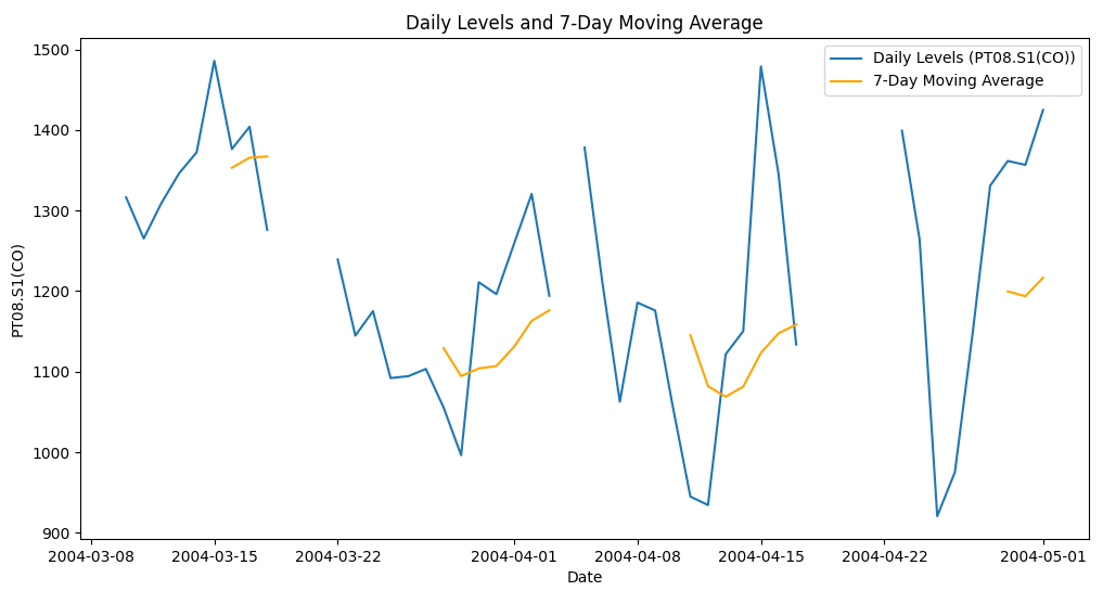
To analyze trends, we use resampling and rolling windows.
Plot the Data: Visualize the original and smoothed data to observe trends.
Resample Data: Resample the data to daily averages to smooth out fluctuations.
Apply Rolling Window: Apply a 7-day rolling window to further smooth the time series.
import pandas as pd

# Load the dataset
data_url = 'https://raw.githubusercontent.com/EdulaneDotCo/kaggle/main/data/AirQualityUCI.csv'
df_air_quality = pd.read_csv(data_url, sep=';', decimal=',', na_values=-200)

# Print the first few rows and column names to verify
print(df_air_quality.head())
print(df_air_quality.columns)

# Ensure 'datetime' is correctly set as index
df_air_quality['datetime'] = pd.to_datetime(df_air_quality['Date'] + ' ' + df_air_quality['Time'], format='%d/%m/%Y %H.%M.%S')
df_air_quality.set_index('datetime', inplace=True)

# Select the required columns (check exact column names from df_air_quality.columns output)
selected_columns = ['PT08.S1(CO)', 'C6H6(GT)', 'PT08.S2(NMHC)', 'PT08.S3(NOx)', 'NO2(GT)', 'PT08.S4(NO2)', 'PT08.S5(O3)', 'T', 'RH', 'AH', 'CO(GT)', 'NMHC(GT)', 'NOx(GT)', 'NO2(GT)']
df_air_quality = df_air_quality[selected_columns]

# Drop missing values
df_air_quality.dropna(inplace=True)

# Ensure the data is sorted by datetime
df_air_quality.sort_index(inplace=True)

print(df_air_quality.head())

import matplotlib.pyplot as plt

# Resample the data to daily averages to smooth out the series
df_daily_air_quality = df_air_quality.resample('D').mean()

# Apply a rolling window to smooth the time series (e.g., 7-day rolling mean)
df_daily_rolling_air_quality = df_daily_air_quality.rolling(window=7).mean()

# Plot the resampled data and rolling mean for one of the columns (e.g., 'PT08.S1(CO)')
plt.figure(figsize=(12, 6))
plt.plot(df_daily_air_quality['PT08.S1(CO)'], label='Daily Levels (PT08.S1(CO))')
plt.plot(df_daily_rolling_air_quality['PT08.S1(CO)'], label='7-Day Moving Average', color='orange')
plt.title('Daily Levels and 7-Day Moving Average')
plt.xlabel('Date')
plt.ylabel('PT08.S1(CO)')
plt.legend()
plt.show()
Output:
Code Explanation:
- Resample Data: We use
df_air_quality.resample('D').mean()to resample the data to daily frequency and calculate the mean for each day. This smooths out the series by aggregating the data into daily averages. - Apply Rolling Window: We apply a 7-day rolling window using
df_daily_air_quality.rolling(window=7).mean(), which further smooths the time series by calculating the average of the current day and the previous six days. - Plot the Data: We use
matplotlibto plot the original daily levels and the 7-day moving average. This helps us visualize the trend and fluctuations in the data.
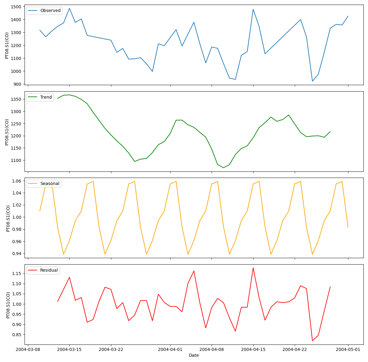
Seasonal Decomposition
Seasonal decomposition helps in breaking down the time series data into trend, seasonal, and residual components.
- Ensure Frequency: Ensure the index has a frequency set.
- Interpolate Missing Values: Fill missing values using interpolation.
- Perform Seasonal Decomposition: Decompose the time series to identify patterns with a weekly period (7 days).
from statsmodels.tsa.seasonal import seasonal_decompose

# Ensure the index has a frequency set
df_daily_air_quality = df_daily_air_quality.asfreq('D')

# Interpolate missing values
df_daily_interpolated_air_quality = df_daily_air_quality.interpolate()

# Perform seasonal decomposition on one of the columns (e.g., 'PT08.S1(CO)') with a weekly period
decomposition_result = seasonal_decompose(df_daily_interpolated_air_quality['PT08.S1(CO)'], model='multiplicative', period=7)

# Plot the decomposed components
fig, (ax1, ax2, ax3, ax4) = plt.subplots(4, 1, figsize=(12, 12), sharex=True)

# Observed
ax1.plot(decomposition_result.observed, label='Observed')
ax1.legend(loc='upper left')
ax1.set_ylabel('PT08.S1(CO)')

# Trend
ax2.plot(decomposition_result.trend, label='Trend', color='green')
ax2.legend(loc='upper left')
ax2.set_ylabel('PT08.S1(CO)')

# Seasonal
ax3.plot(decomposition_result.seasonal, label='Seasonal', color='orange')
ax3.legend(loc='upper left')
ax3.set_ylabel('PT08.S1(CO)')

# Residual
ax4.plot(decomposition_result.resid, label='Residual', color='red')
ax4.legend(loc='upper left')
ax4.set_ylabel('PT08.S1(CO)')
ax4.set_xlabel('Date')

plt.tight_layout()
plt.show()
Code Explanation:
- Ensure Frequency: We set the frequency of the datetime index to daily using
df_daily_air_quality.asfreq('D'). This ensures the time series is evenly spaced, which is required for seasonal decomposition. - Interpolate Missing Values: We fill any missing values using linear interpolation with
df_daily_air_quality.interpolate(). This ensures there are no gaps in the data. - Perform Seasonal Decomposition: We use
seasonal_decomposeto decompose the time series into observed, trend, seasonal, and residual components. We specify a multiplicative model and a period of 7 days to capture weekly patterns. - Plot the Decomposed Components: We plot the observed, trend, seasonal, and residual components using
matplotlib. This helps us understand the underlying patterns and variations in the data.
Output
Visualization
Visualization helps in understanding and communicating the findings effectively.
Visualize Decomposed Components: Plot the decomposed components (observed, trend, seasonal, and residual) for better insights.
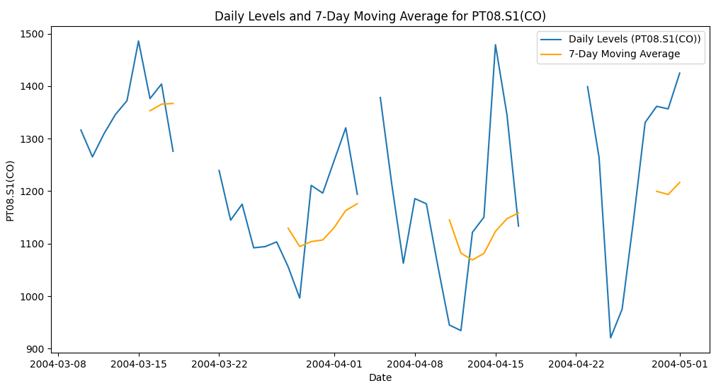
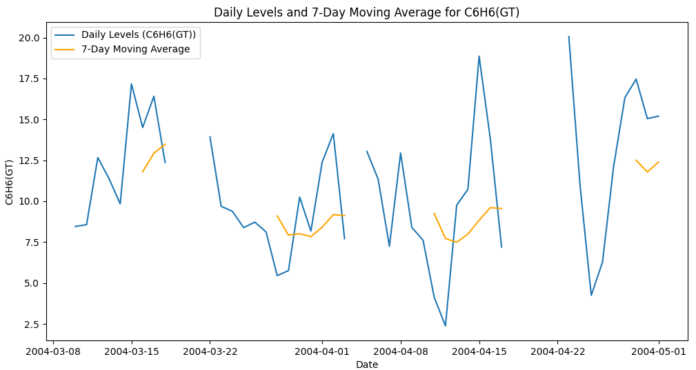
Visualize Original and Smoothed Data: Plot multiple columns to observe trends.
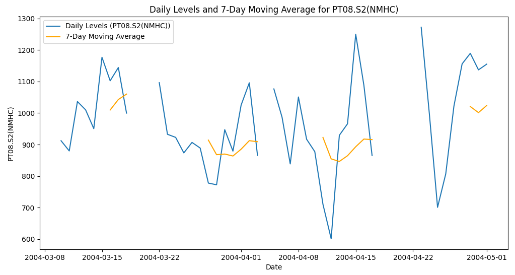
# Visualize Original and Smoothed Data for multiple columns
columns_to_plot = ['PT08.S1(CO)', 'C6H6(GT)', 'PT08.S2(NMHC)']

for column in columns_to_plot:
    plt.figure(figsize=(12, 6))
    plt.plot(df_daily_air_quality[column], label=f'Daily Levels ({column})')
    plt.plot(df_daily_rolling_air_quality[column], label='7-Day Moving Average', color='orange')
    plt.title(f'Daily Levels and 7-Day Moving Average for {column}')
    plt.xlabel('Date')
    plt.ylabel(column)
    plt.legend()
    plt.show()

# Visualize Decomposed Components for 'PT08.S1(CO)'
fig, (ax1, ax2, ax3, ax4) = plt.subplots(4, 1, figsize=(12, 12), sharex=True)

# Observed
ax1.plot(decomposition_result.observed, label='Observed')
ax1.legend(loc='upper left')
ax1.set_ylabel('PT08.S1(CO)')

# Trend
ax2.plot(decomposition_result.trend, label='Trend', color='green')
ax2.legend(loc='upper left')
ax2.set_ylabel('PT08.S1(CO)')

# Seasonal
ax3.plot(decomposition_result.seasonal, label='Seasonal', color='orange')
ax3.legend(loc='upper left')
ax3.set_ylabel('PT08.S1(CO)')

# Residual
ax4.plot(decomposition_result.resid, label='Residual', color='red')
ax4.legend(loc='upper left')
ax4.set_ylabel('PT08.S1(CO)')
ax4.set_xlabel('Date')

plt.tight_layout()
plt.show()
Code Explanation:
- Visualize Original and Smoothed Data: We iterate over multiple columns and plot the daily levels and 7-day moving averages for each column. This helps us compare the trends and fluctuations across different pollutants.
- Visualize Decomposed Components: We plot the observed, trend, seasonal, and residual components of the ‘PT08.S1(CO)’ column. This helps us understand how the data is decomposed into different components and identify any underlying patterns.

Conclusion
By following these steps, you can effectively analyze air quality data, identify trends and seasonal patterns, and visualize the findings. This structured approach ensures you cover all essential aspects of time series analysis and make informed decisions based on the data insights.
Professional LinkedIn Post Format
🚀 Unveiling Air Quality Insights with Python! 🌍💨 🚀
I’m thrilled to share my latest project where I dive deep into air quality data, focusing on NO2 levels, to uncover key trends and patterns. Here’s a detailed look at how I achieved this and the insights gained!
🔬 Project Overview: In this project, I analyzed air quality data using Python, performing data cleaning, resampling, rolling window analysis, seasonal decomposition, and visualization to gain valuable insights.
📚 Libraries Used:
- pandas: For data manipulation and cleaning.
- matplotlib: For creating visualizations.
- statsmodels: For time series analysis and seasonal decomposition.
🔍 Step-by-Step Analysis:
- Data Preparation 🧹:
- Loaded and cleaned the dataset to handle missing values and ensure it was ready for analysis.
- Selected relevant columns for a focused analysis on NO2 levels and other key variables.
- Resampling and Rolling Windows 📊:
- Resampled the data to daily frequency to provide a clearer view of daily trends.
- Applied a 7-day rolling window to smooth the data and highlight underlying trends.
- Seasonal Decomposition 📈:
- Decomposed the data into trend, seasonal, and residual components to better understand the underlying patterns.
- Visualization 🎨:
- Created comprehensive visualizations to effectively communicate the findings, including plots of the original data, rolling mean, trend, and seasonality.
🌟 Key Takeaways:
- Smoothed data revealed more stable trends, removing short-term fluctuations.
- Seasonal decomposition helped identify recurring patterns, providing insights into how NO2 levels vary over time.
Check out the full analysis on Kaggle and GitHub to explore the detailed code and findings!
#DataScience #Python #AirQuality #NO2 #DataAnalysis #DataVisualization #TimeSeriesAnalysis #SeasonalDecomposition #Analytics #MachineLearning #Environment #BigData
Kaggle Notebook
Title : Analyzing Air Quality Data: Trends and Patterns with Python
Description : Welcome to this comprehensive analysis of air quality data! In this notebook, we will delve into the NO2 levels to uncover trends, seasonal patterns, and key insights using Python. The steps are meticulously outlined and explained to help you understand each part of the process.
Project Overview
This project aims to analyze air quality data, specifically focusing on NO2 levels, to uncover trends, seasonal patterns, and insights. By using Python’s powerful data manipulation and visualization libraries, we will:
- Clean and preprocess the data to ensure accuracy.
- Resample the data to aggregate it at a daily level.
- Apply rolling windows to smooth the data and highlight trends.
- Perform seasonal decomposition to separate the data into trend, seasonal, and residual components.
- Visualize the findings effectively to communicate the insights.
Table of Contents
- Introduction
- Data Preparation
- Resampling and Rolling Windows
- Seasonal Decomposition
- Visualization
- Conclusion
Introduction
Air quality is a critical environmental factor impacting public health and the environment. Analyzing air quality data helps in understanding pollution levels and their trends over time. This notebook focuses on the following key steps:
- Data Preparation
- Resampling and Rolling Windows
- Seasonal Decomposition
- Visualization
Data Preparation
In this section, we will clean and preprocess the air quality data. Proper data preparation ensures accurate and reliable analysis.
Resampling and Rolling Windows
We will resample the data to daily frequency and apply a rolling window to smooth the data. This helps in identifying trends more clearly.
Seasonal Decomposition
Seasonal decomposition allows us to break down the time series into trend, seasonal, and residual components. This helps in understanding the underlying patterns in the data.
Visualization
Creating visualizations helps in effectively communicating the findings. We will combine various plots to show different aspects of the data, including raw data, smoothed data, and decomposed components.
Conclusion
This notebook demonstrated how to analyze air quality data using Python. We performed data preparation, resampling, rolling window analysis, seasonal decomposition, and visualization to uncover key trends and patterns in NO2 levels. The insights gained from such analyses can be crucial for environmental monitoring and public health planning.